


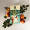

Mantra Artisan Ales Cassis Amour Rouge
The Challenge
The next step in Mantra Artisan Ale’s evolution in the market has been the release of a higher end 750 ml bottled product line, characterized by the same playful experimentation as always, but, this time, courting a consumer who leans toward the wine aficionado. The first release in this format was decided to be a Cassis blend (currants and tart cherries) of one of their Brettanomyces ales, Amour Rouge, a Flanders-style sour red. Mantra asked that the packaging resemble the sophisticated feel of the wine market’s design sense, but still convey Mantra’s organic, hand-crafted aesthetic.
Brewmaster Morse went through the highly methodical and mathematical process of blending the Cassis. This was especially inspirational to Richter as they always are looking for crossover of the senses when looking for ways to represent something as intensely specific as flavors of beer. In addition to sharing his vision of the visual direction of this packaging, Morse also poured a sampling of each of the beers that would be ultimately blended into Cassis. This provided not only flavors that were inspirational, but also the colors of the ingredients themselves, most notably the brewed-on-currant element with it’s intense deep magenta body and brilliant pink head. This unique experience of being able to taste the different parts of the blend independently helped the designers deconstruct the final experience, which turned out to be very helpful in kick-starting the conceptual stage of this design.
Conceptualization
Back in the studio, Verónica began sketching type and discussing the shape of the label with Jonathan, who experimented with different ways of illustrating cherries and currants. Watercolor bleeds were to be a prominent element in the design, so a wide sampling of watercolor bleeds were made in order to later combine into the final illustration. One motif that Mantra’s design style has adopted is a sketchbook-style of vignettes depicting either brewing concepts, flavor descriptions, or just general emotional connections to the particular beer. To research the prospect of creating more of these for Cassis, the designers researched Brettanomyces chemical interactions as well as sketchbook pages from Leonardo DaVinci. One strong source of inspiration found in his sketchbooks was a plant study that evokes a connection to the Art Nouveau movement. On the lookout for a layout that could scaffold all of the 750ml label designs, the hope was that this type of design could work well within an unusual die-cut and interact with hand-drawn type well.
Veronica continued to develop the typographic concepts, researching script faces that might speak to the types of flourishes that this sour beer embodies. She was looking for an atypical script that was rooted in the classical, but had a fluidity to it that could break free of a grid and explore into the surrounding illustration. Ultimately, it was decided that the best place to start would be one of her drawn titles and use the brushes in Adobe Illustrator to refine. At the same time, a shape for the label was established and brought from Illustrator into Autodesk Maya. This process of handing files off between 2d and 3d software has become indispensable to Richter’s process of designing packaging, as it allows for not only visualization of the label on the physically accurate bottle shape, but also allows for manipulation of materials such as embossing and foil stamping with physically accurate material descriptions. It is always a struggle when designing for a 3-dimensional product to not judge a design by the 2-dimensional layout at any point, so the continual hand-off of design from 2d to 3d has turned out to be creatively freeing. Additionally, sending the designs for review to Mantra as 3d renders allowed for everybody to have a more predictable and reliable visualization, short of having the actual label on the bottle.
Process
With a basic, possibly close-to-final label shape in place and the main typography blocked in, Jonathan worked within the negative space to create an illustration based on the DaVinci design, using a combination of Nouveau-like flourish shapes, currants, and cherries. The idea was to frame the central type with this thematic illustrated vignette element on all of the labels for the 750ml releases. Richter decided, though, that this execution felt too static and rigid, not at all embodying the loose and wildly experimental quality of the product.
Back to sketching, Jonathan focused on conveying a spontaneous sketching style, solidifying the elements with tightly rendered surfaces only in a narrow focus area, relying on quick cross-hatching for everything else. This approach allowed for there to still be a framing effect around the central design, while maintaining a sense of movement and flow encircling and interacting with the typography. Watercolor bleeds and drips were layered in with the focus areas of the illustration, then.
Richter then carried elements of previous packaging, mostly from Amour Rouge, into the rest of the label. Rather than the using a repeated ornament element from the other Mantra packaging, it was decided that a moiré wave pattern in the background would be best for creating a cleaner space for the label and it’s overall shape.
After a speedy review and approval with Mantra, thanks to the 3d renders, the printer went to work producing the label, and Richter turned its attention to the the rest of the bottle. To round out the overall design of the bottle, the designers suggested a stamped wax dip over the crown would produce a further unique look for the product. Rather than using a more traditional deep red wax for dipping the top of the bottle, a white wax was used, serving as a visual connection to the embossed swirl elements on the label as well as a conveyance of the creaminess of the beer itself. Jonathan 3d modeled and printed a handful of wax stamps with a PolyJet printer, which provided the resolution required for reproducing the elements of the logo.
The experience of developing this packaging for Mantra epitomized what it is to work for a supportive and creative client. Mantra, all along the way, was articulate about what inspired them to make this beer as well as what they hope the reception to such a unique beer would be. Now with this established design completed, Richtergarten is looking forward to creating more similar labels for this client in the future.
No Comments
Sorry, the comment form is closed at this time.