


STEEL BARREL: FINDING THE SOUL OF THE BRAND
STEEL BARREL BREWING COMPANY
INTO THE WILD. Steel Barrel understood that their product needed to jump out at consumers from across the aisle, so Richtergarten approached this challenge with simplicity and timelessness in mind. Americana and Frost had to convey the legacy and tradition from which the big brands had grown, yet relate to the modern sensibility of the craft beer movement (without dating itself as a “hipster beer”). Steel Barrel wanted “Americana” and the Southern Pride of the American working class to be themes that flowed through everything.
DISCOVERING THE SOUL. Steel Barrel is being birthed from the spirit of adventure as they build their brewery on an 80+ acre wilderness outside of Nashville. As Richtergarten dug deeper into the pioneering soul that seemed to want to define the brewery, we unearthed a singular voice: Walt Whitman’s. His “O MAGNET-SOUTH!” spoke to exactly what we felt about this brand. Immediately, things began to fall into line: the poetic values of the proud working class, the building of bridges through the wild lands of the South, and the simplicity of strong, direct words and images. Whitman’s poetry became an influence in all of the work, even to a point of being featured at the top of the cans themselves.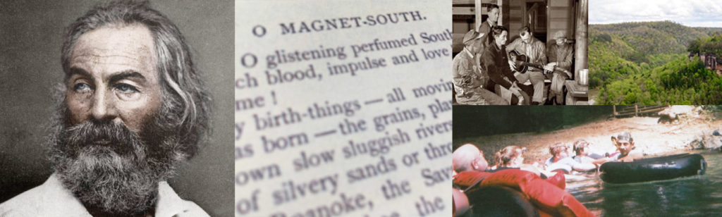
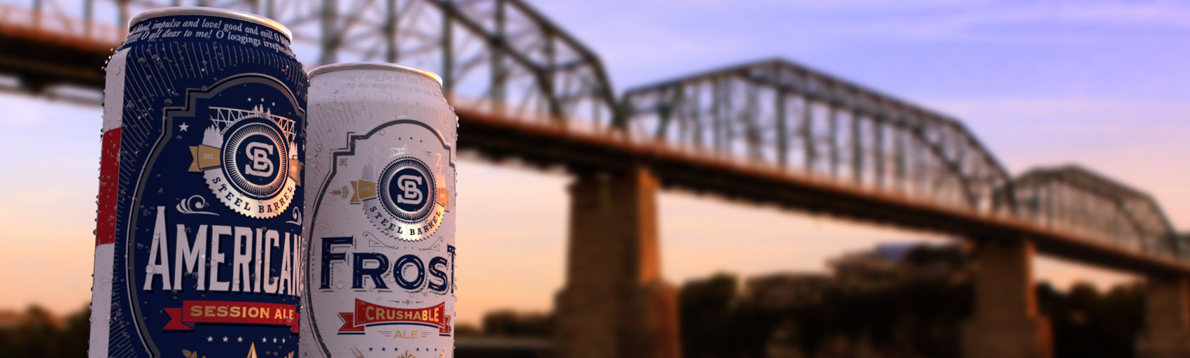
BUILDING BRIDGES IN A TIME OF WANTING WALLS. Establishing a logo was the first proof of these ideas. The influence of vintage labor union badges became the centerpiece of a narrative we tell. The bridge in the middle of nature, born from industry and raw steel, is the setting for a group of workers enjoying rest from a hard, honest day’s labor. Crowning this peaceful moment are Tennessee’s stars overhead, promising a future of growth and brotherhood. “Beer is a bridge that connects people,” was a comment from the client that stuck with us, and this illustrative element became a unifier for the logo. 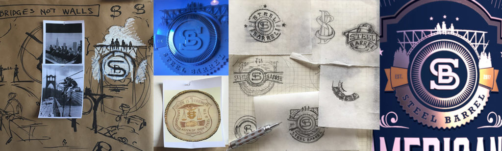
RED, WHITE, AND NEW. The client requested that the brand’s colors be those of the Tennessee and American flags, which played perfectly into the concept of patriotism. Out of this theme came the use of stars, eagle’s wings, banners, and emblems found in coats-of-arms. Small touches of gold punctuates this palette with a sense of legacy and pride while the influence of americana in the band of stripes down the can’s side recalls the well-loved and worn features of our culture. A “vintage-modern” aesthetic enters into the design in the form of layered engraving-style illustrations and strong, focusing linear elements. Richtergarten infused the sense of pride in the land as a main branding point as revealed in even the smallest of details: “This land is your land: Please recycle.”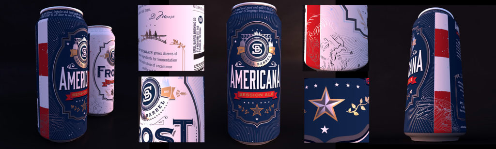
Following the compass of the brief’s intent, working closely with the client, as well as keeping focused on the target market throughout the entire process were key for Richtergarten in the development of Steel Barrel’s brand.
No Comments
Sorry, the comment form is closed at this time.