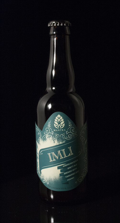
Part of what makes Mantra Artisan Ales such a unique brewery is their constant invention of new recipes. Focusing on sour beers that were to be released on a regular basis throughout the year needed packaging that, while consistent with the graphic style of Mantra’s family of seasonal offerings, had the look of a larger family of spontaneously released beers.
The challenge was to design a template-driven label for Mantra’s single release beers in 375ml bottles that would be easy to update by the client by substituting name, color, and other information, while retaining Mantra’s dynamic branding within a limited release beer.
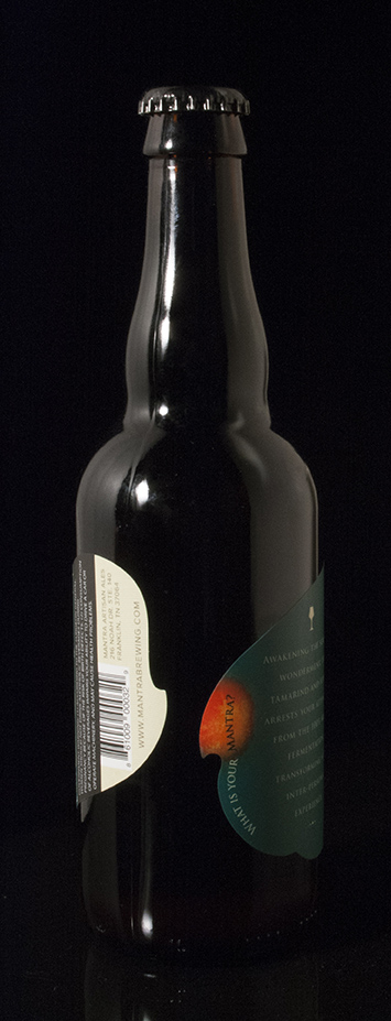
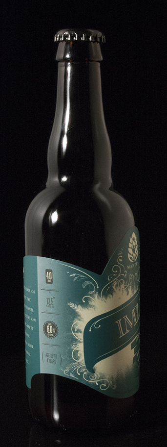
Starting with an unconventional, but classically inspired die cut shape for the label, Richtergarten combined the motif ink bleed they had established for the brand with hand-rendered ornamentation to illustrate the explosion that occurs from the collision of art and science. In designing for a bottle label, the negative space is as much consideration as the printing on the label itself. Often, on store shelves, the bottles can be left facing backward, so we wanted to give the back of the bottle an interesting twist as well. This was accomplished by giving the label’s die cut curved flowy lines, making the negative space look like liquid pouring, and by calling attention to it with the sunburst design previously used on the rest of the series.